

UNVEILING THE ARCHITECTURE BEHIND EMPOWER’S NEW LOGO
Written by Jessica Murray
The meaning behind Empower’s logo
What’s in a logo?
For Empower, quite a bit. Today, I’m excited to reveal our new logo, a strong visual representation of our commitment to driving business success.
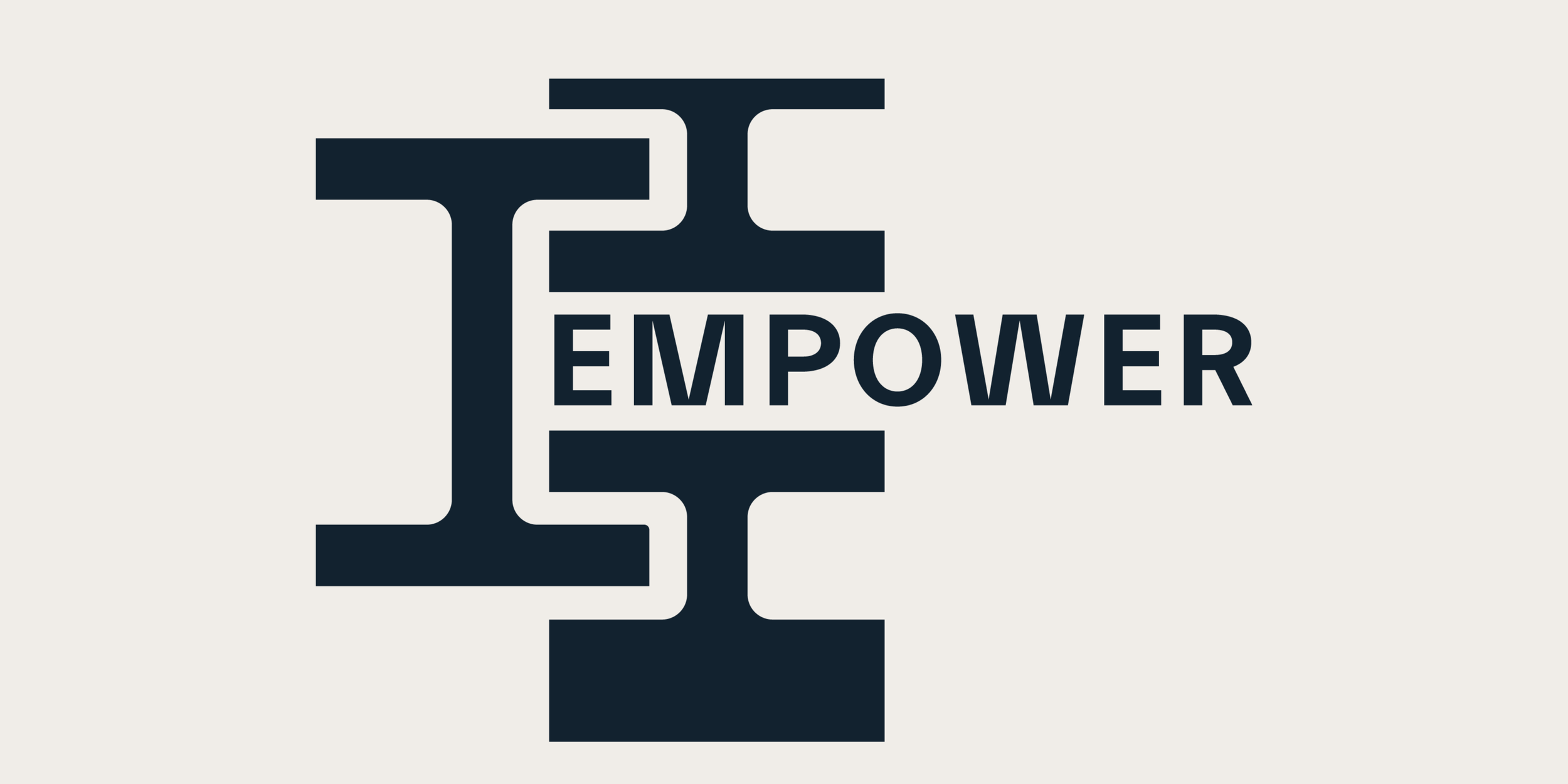
Upon first glance at the logo, you see the “Empower” wordmark sandwiched between three abstract interwoven “I” shapes. But, as you’ll learn, there’s more than meets the eye.
I’m going to deconstruct the elements and meaning behind the new logo so you better understand how it’s not just an image, but rather an embodiment of our philosophy and purpose.
The foundation: business design

When you arrive on Empower’s website, you immediately see the phrase, “business design for long-term growth.” Those words are intentional.
We partner with emerging business owners and founders to build (or re-build) their businesses to effectively execute their vision. We don’t just consult; we architect and co-create. We see ourselves as close collaborators, creating strong operational foundations and surfacing creative solutions to drive success.
Business design is also an emerging strategic approach that combines business analysis, innovation and design-thinking principles to optimize business models. This concept is key to our work and, consequently, our visual identity.
Inspirations from architecture
Design and architecture became key tenets as we developed our brand identity. As we explored visual concepts in these realms, three elements stuck with us:
Joinery: This is a part of woodworking that involves joining pieces of wood to produce more complex, appealing and long-lasting projects. There are many types of joints, but we specifically focused on the dovetail joint because of its strength and durability.
I-beams: Structural steel shapes that serve as critical foundations for construction.
Pillars: Essential elements for a building’s stability and longevity.
Do you see a theme emerging?
The logo construction
Now that you understand why we connected Empower’s brand with design and architecture, let’s walk through how this manifests in the logo.
As you can see, the primary logo consists of three abstract “I” shapes surrounding our wordmark. The “I”s can also stand alone as our secondary logo. This imagery evokes the concepts of structural support and building foundations like the I-beam and pillars. The style is intentionally modern because we focus on delivering innovative and tailored solutions to Empower’s partners.

Additionally, we integrate joinery by showing how those three “I”s become interconnected and locked into place, signifying to the ability to endure. Joinery is about seamless integration versus bolting things together, similar to how we build unified processes that join pieces of a business together. The shape stacking was also considered to add visual appeal and convey a sense of building upwards.
Just as each element of our logo was carefully considered, we take the same meticulous approach to our partners’ businesses. We put thought and care into every interaction and don’t believe in a one-size-fits-all approach. Our collaborative nature enables our ability to define a blueprint that will pave the way for long-term success. We’re not just revealing a new logo - we’re reaffirming our commitment to architecting businesses to last.
Do you have an immediate reaction to our logo and its story? We'd love to hear what it means to you!